Responsibilities
Lead UX Designer along with 3 group members
Client Meetings, Primary and Secondary User Research, Wireframing, Prototyping, Usability Testing
Pushing through with red bull🔴 🐂 and late-night oil🚀
Project Context
A client project
Designed in 2.5 weeks: July 2022
THE CLIENT
Sanaa Hyder Therapy & Coaching
Sanaa Hyder is a licensed therapist, life coach, entrepreneur, and first-generation South Asian Muslim.
She offers 1:1 therapy sessions as well as a course that helps her clients reflect and achieve life goals.
She is interested in multi-cultural identity and in striking a balance between Eastern and Western cultures.
Her target clients are South Asian women between 24-45 years old living in big cities across the States.
PROBLEM
“I launched my website and noticed the bounce rate is 60%. ”
Sanaa uses Squarespace to create her own website for her private practice. This has helped to establish her practice online; however, that website wasn’t doing what it was supposed to do: get more clients into her business.
My team and I were tasked with
understanding what is stopping users landing on Sanaa’s website from exploring more;
providing solutions through redesigning the website to drive more foot traffic and business.
THE SOLUTION
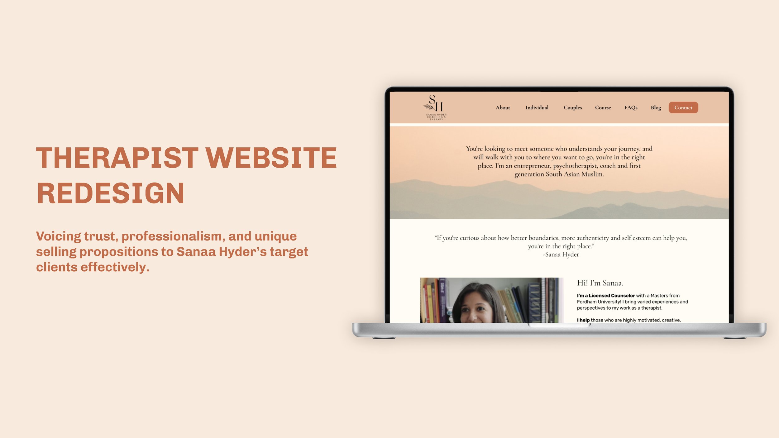
Effectively presenting Sanaa as a trustworthy and qualified therapist who can relate to clients’ background (link to our final prototype)
Solution 1: Optimize the navigation
Split up Services into two tabs - Individual and Couples
Give FAQs their own tab and page
Solution 2: Introduce a customized design system
Solution 3: Create an SEO-friendly content strategy
Improve loading speed by minimalistic and uncluttered design
Split contents into small chunks to upgrade readability and accessibility
Add internal links to pass link juice from one page to another to ensure a natural flow
Highlight and reinforce USP to help conversion
ONE THING WE INSISTED
We conducted 6 client meetings to involve Sanaa early and often
I believe that products are only successful if they are both viable and usable. Our goal was to find the sweet spot between business goals, user needs and technical constraints. Through these meetings…
we learned about her, her target clients, and her business goals;
we asked her to walk us through the current website and share her opinions;
we shared with her our design progress;
we asked for feedback and explained why some were not adopted.
DESIGN PROCESS
Double Diamond
These are the steps we took. I will be walking you through them along with our thought process.
SECONDARY RESEARCH
1 in 5 US South Asians report experiencing a mood or anxiety disorder in their lifetime
I did secondary research to explore important questions and concerns in the field of study. According to multiple studies, a silent mental health crisis exists among U.S. South Asian communities. Mental health problems are common for US South Asians, with women reporting higher levels of distress than men. US South Asians often express greater stigma toward mental illness than other groups. Stigma toward mental illness is a major barrier to getting help.
Chances always go with challenges. Sanaa does have a large market to be awakened.
COMPETITIVE ANALYSIS
Successful competitors do a lot of things effectively, at the same time
We analyzed 3 therapy websites—Michelle Harwell Therapy, Minaa B Consulting, Midtown MFT—to gather useful insights about what make them successful in the field.
We found out that they share a lot of similarities:
personalities are evoked through the right combination of fonts and colors;
authority and trust are built by presenting testimonials and reviews;
contents are broken down and showed in a visually dynamic way;
call to action is strong and powerful;
navigation is easy and clear.
COMPARATIVE ANALYSIS
Course examples help people understand what to expect
Sanaa wants to attract more clients signing up for her therapy prep course. Thus, we conducted comparative analysis with some well-recognized course provides in other fields—Guitar Super System, Chloe Ting, Master Class—to gain inspirations. They are good at giving a glance of what they are offering in the course, including structure of the courses and pieces of examples.
WEB ANALYTICS
After pulling the data from google analytics for 2021- we compared it to 2020’s
Sanaa especially mentioned that she was bothered by the high bounce rate, so we dug into google analytics data of 2021 and 2020.
The total users increased by 35%; but the number of sessions per user, average duration, and bounce rate has stayed relatively the same.
With number of sessions per user at 1.16, it means that users were only looking at one page and not exploring further on the site, such as the course and services pages.
With a bounce rate of 87%, either users found everything they need or couldn’t find the information that they needed. It would be unlikely users on the homepage have found that they want since the page doesn’t have any direct contact information.
USER INTERVIEWS
We conducted 17 interviews and 70% of our participants fall into Sanaa’s target demographic
Constrained by the confidential policy, we were not able to access Sanaa’s current clients. We tried hard to recruit interviewees who are close to Sanaa’s target clients to get the right data instead of quick data. I recruited and interviewed 5 participants.
QUESTIONS ASKED
What is your overall opinion on mental health?
What factors do you consider important when searching for a mental health therapist?
What features and/or characteristics on a mental healthcare providers’ webpage makes it a safe and trustworthy space?
USABILITY TESTING ROUND 1—CURRENT SITE
Our goal was to identify any pain points users are experiencing while interacting with Sanaa’s current site
We conducted usability testing on current site with 10 users. We asked them to finish 2 tasks and provide any feedback.
TASKS
Find relationship coaching and book a session.
Sign up for the prep course.
5 main complaints
THE MAIN INSIGHTS
“I chose the therapist according to how clear the information they provide me with, for example, qualifications, prices, how does this system work.”
We combined and synthesized our research and usability testing findings, a clearer picture of users’ experience started to form.
PERSONA
The Well-Being Seeker
MID-FIDELITY PROTOTYPE
Added more details + connections between screens
We began our development phase with a design studio. After we had a shared vision, we created low-fidelity wireframes. We added more information and connections between screens to create a mid-fidelity prototype.
USABILITY TESTING - ROUND 2
Users enlightened us about existing problems and undiscovered opportunities
To learn more about user’s behavior and preferences, we conducted the same tasks as in round 1 with 8 participants on our mid-fidelity prototype.
3 major improvements
Based on the observation as well as the feedback from the participants, we iterated our design with 3 major improvements.
1) Replaced the position of newsletter sign-up
On current state usability testing, users preferred to learn more about Sanaa before deciding on newsletter sign-up. Thus, we lowered the sign-up section.
But on this round of testing, users were confused that why there were two sign-ups on the home page; and they were wondering if these two sign-ups were different because they were too close to each other. We relocated one sign-up higher up.
2) Created separate forms for different inquiries
From user interviews, we learned that users want to Sanaa’s booking availability more easily; thus, we added Google Calendar feature.
Users complained that “book a session” is different than “contact me” and felt that they landed on the wrong page. Targeting this pain point, we created 3 forms for 3 inquiries: contact Sanaa in general, book a session for individual therapy, book a session for couples therapy.
3) Updated the FAQs section to accordion layout
Original FAQs section was hidden at the bottom of Services page. We gave FAQs its own page to make questions users care the most more accessible.
Users complained about the font size in second round of usability testing. I implemented the style guide and brought the accordion layout to live.
CLIENT MEETING on hi-fidelity prototype
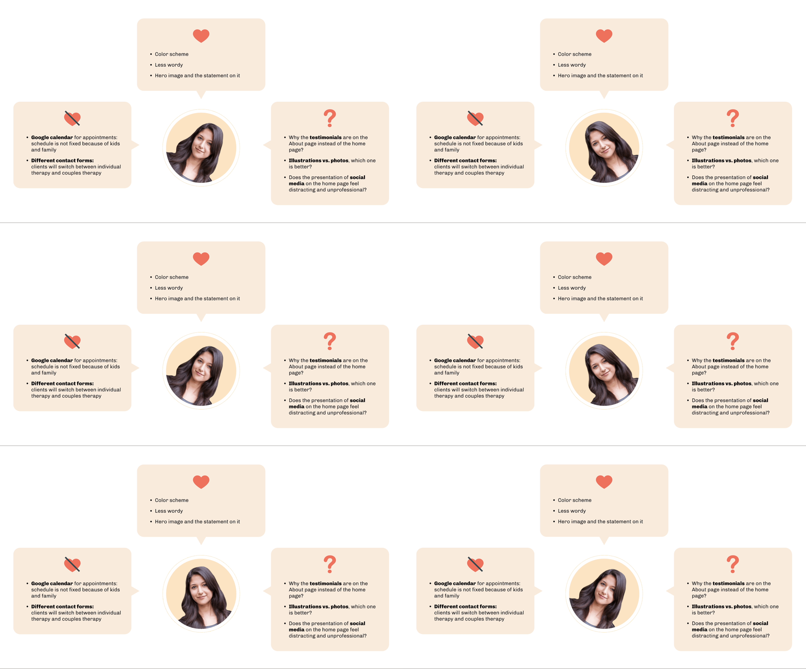
Sanaa liked…didn’t like…was not sure about…
After adopting user feedback into our design, we continued the process by implementing the style guide, rewriting some copies, and adding more details to get the hi-fidelity prototype ready for the 4th client meeting.
TEAM’S DECISIONS
We iterated…we insisted…we reached out to users…
We took off the google calendar feature even users want to see the overall booking calendar because Sanaa’s unfixed availability is a constraint that will not change.
We used research findings to back up our decision to have separate contact forms. We addressed Sanaa’s concern by adding additional options in the forms for users to choose from.
We decided to conduct 3rd round of usability testing and two A/B testing to find the answers for Sanaa’s remaining questions.
USABILITY TESTING - ROUND 3
The score for overall usability increased by 62%
We conducted another round of usability testing on the iterated hi-fi prototype with 7 users and the tasks remained the same. We saw great improvements showed by data.
Opinion on social media presentation
Users said they would like to see social media presentations as long as the posts are relevant insights and tips on therapy.
A/B TESTING
5 out of 7 users preferred illustrations to real photos
They stated that illustrations made the website seem more professional and feel more modern.
6 out of 7 users preferred the testimonials on the home page
Majority people thought the home page is where the testimonial belonged. 1 user only wanted them on the home page if it was one testimonial at a time and not too much text.
More iterations
3 major improvements
1) Added testimonials to home page
We decided to present testimonials on both home page
I updated the testimonials into functional carousal style to make them more readable and digestible
2) Added button animation
I created component sets, enabling buttons responsive to users’ actions
These subtle considerations will encourage users explore more on the site
3) Added more visual cues
We made the process and approach more scannable
I added location indicators on the navigation to help users orient themselves on the site
final CLIENT meeting before presentation
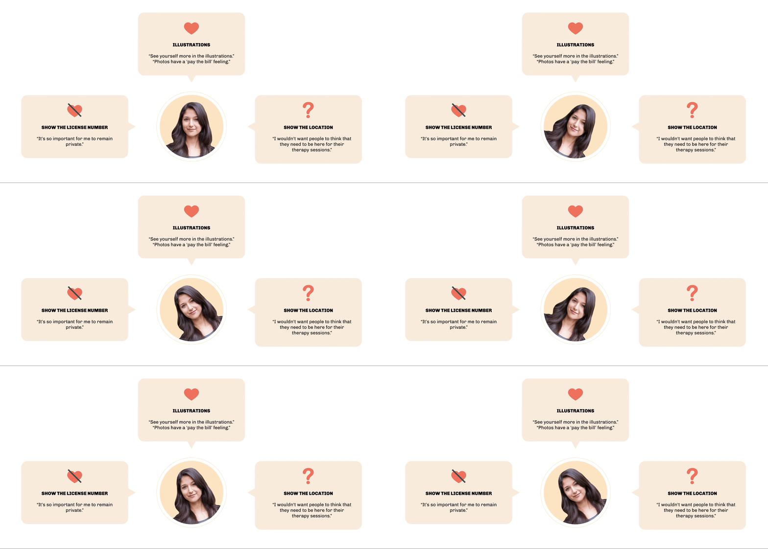
Sanaa bought the use of illustrations, but she didn't like...and wasn’t sure about…
Sanaa was convinced by the usability testing findings and felt comfortable and confident using illustrations. However, she didn’t want to put her license number in the Credential section on the About page because of privacy concern. In addition, she was hesitant about showing her location.
TEAM’ S DECISIONS
We changed…we convinced her to…
We took her license number off the site due to her insistence. We convinced her to keep the location information successfully with data gathered from competitive analysis, user interviews, and usability testing.
THE FINAL SCREENS
Link to our final prototype here
NEXT STEPS
What we can do in the future:
Create a mobile prototype.
Monitor Google Analytics to see if bounce rate decreases and average site duration increases after changes have been implemented on SanaaHyder.com (Quarterly).
Conduct more research specially focusing on Sanaa s target clients–South Asian women living in America.
CONCLUSION + LESSON LEARNED
What have I learned?
This is the first client project I ever have. Sanaa was very pleased with the improvements and edits we recommended. These are my take-aways:
Working with clients can be messy. We need to recognize constraints, ask tough questions, and make infectible tradeoffs. Ultimately, UX design is not just about aesthetics; it helps people by solving their problems.
Embrace personalization. Team working was not always smooth on this project. We disagreed on so many things, such as questions for Sanaa, color scheme, home page layout, etc. But I always remember an article - We Wouldn’t Argue So Much If It Didn’t Matter So Little - I saw on Medium, I listened to my team members, shared my opinions, and reminded them of our core beliefs when the arguments were taking too long.
Iteration brings powerful results. Users have answers to your questions. Reach out to users, conduct testings, and iterate as much as you can until you are satisfied that you’ve reached the best possible design within the time constraint.


